# Don't forget to load the tidyverse package:
library(tidyverse)

# Read the coral_cover data:
dat_coral_cover <- read.csv("https://raw.githubusercontent.com/andieich/practicals_envrisk/refs/heads/main/data/coral_cover.csv")TP: Environmental Risk
Work Sheet 2
Task 2.1: Explore the coral_cover data set
Data is already loaded:
coral_cover data set
| year | date | site | transect | percent |
|---|---|---|---|---|
| 2005 | 2005-02-16 | Haapiti | 1 | 32 |
| 2005 | 2005-02-16 | Haapiti | 2 | 18 |
| 2005 | 2005-02-16 | Haapiti | 3 | 36 |
| 2005 | 2005-02-16 | Taotaha | 1 | 32 |
| 2005 | 2005-02-16 | Taotaha | 2 | 42 |
You can use R functions to answer the questions or open the data frame in Excel:
Which years are covered?
Are there any gaps?
1dat_coral_cover %>%
2  select(______) %>%
3  distinct() %>%
4  summarise(______ = diff(______))     %>%
5 filter(______ != ______)- 1
-
Take the
dat_coral_coverdata set, and then, - 2
-
only select the
yearcolumn, then, - 3
-
remove any duplicated rows with
disticnt(), then, - 4
-
calculate difference between years with
diff(columnname), then, - 5
-
show only rows in which the difference is not (
!=) 1
1dat_coral_cover %>%
2  select(year) %>%
3  distinct() %>%
4  summarise(diff_year = diff(year))     %>%
5 filter(diff_year != 1)- 1
-
Take the
dat_coral_coverdata set, and then, - 2
-
only select the
yearcolumn, then, - 3
- remove any duplicated rows, then,
- 4
- calculate difference between years, then,
- 5
- show only rows in which the difference is not 1
Solution: No gaps
How many sites?
Same number of transects per site and year?
- 1
-
Take the
dat_coral_coverdata set, and then, - 2
-
group by
siteandyear, then, - 3
- calculate the number or rows per group, then
- 4
- show only rows in the number of rows is not 3
Solution: Always 3 transects per site and year
Task 2.2: Make a similar plot
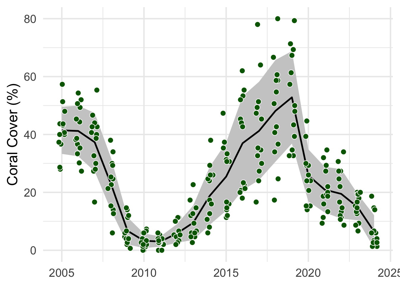
- The points are the mean
percentvalues per site - The line is the mean of these mean values
- The shaded area in this mean ± the standard deviation
sd()
# Calculate the mean coral cover per site and year
1dat_coral_cover_sitesS <- dat_coral_cover %>%
2  group_by(______, ______) %>%
3  summarise(percent = mean(______))

# For each year, calculate the mean and sd of the mean cover per site
4dat_coral_coverS <- dat_coral_cover_sitesS %>%
5  group_by(______) %>%
6  summarise(mean_percent = mean(______),
7            sd = sd(______))

# Plot the data
8  ggplot(mapping = aes(x = ______))+
9  geom_ribbon(data = ______,
10              aes(ymin = ______, ymax = ______), fill = "grey80")+
11  geom_line(data = ______,
12            aes(y = ______)) +
13  geom_point(data = ______,
14             aes(y = ______),
15             position = position_jitter(width = .2, seed = 1))  +
16  labs(x = "______", y = "______") +
17 theme_minimal()- 1
-
Make a new summary data frame called
dat_coral_cover_sitesS. Take thedat_coral_coverdata frame and - 2
-
group it by
yearandsite, then, - 3
- calculate the mean percent value.
- 4
-
Then, create another summary data frame called
dat_coral_coverS. Take the just createddat_coral_cover_sitesSsummary data frame and - 5
-
group it by
year, then, - 6
- calculate the mean
- 7
-
and standard deviation (
sd()). Now you are ready to plot the data. - 8
-
Make a new ggplot, store in
aes()the axes that will be used in all layers.yearshould be plotted on the x axes, the variable names for the y axis differs for the layers (percentandmean_percent). - 9
-
Add a
geom_ribbon(). Usedat_coral_coverSas input data - 10
-
and
mean_percent - sdforyminandmean_percent + sdforymax. You can define the fill color withfill. - 11
-
Add a
geom_line(). Usedat_coral_coverSas input data - 12
-
and
mean_percentas y axis. Then, - 13
-
add a
geom_point(). This time, usedat_coral_cover_sitesSas input data - 14
-
and
percentas y axis. - 15
-
You can randomly wiggle the position of the points to show the variability with
position_jitter(). - 16
- Define the axis titles
- 17
- and select a theme.
# Calculate the mean coral cover per site and year
1dat_coral_cover_sitesS <- dat_coral_cover %>%
2  group_by(year, site) %>%
3  summarise(percent = mean(percent))

# For each year, calculate the mean and sd of the mean cover per site
4dat_coral_coverS <- dat_coral_cover_sitesS %>%
5  group_by(year) %>%
6  summarise(mean_percent = mean(percent),
7            sd = sd(percent))

# Plot the data
8  ggplot(mapping = aes(x = year))+
9  geom_ribbon(data = dat_coral_coverS,
10              aes(ymin = mean_percent - sd, ymax = mean_percent + sd), fill = "grey80")+
11  geom_line(data = dat_coral_coverS,
12            aes(y = mean_percent)) +
13  geom_point(data = dat_coral_cover_sitesS,
14             aes(y = percent),
15             position = position_jitter(width = .2, seed = 1)) +
16  labs(x = NULL, y = "Coral Cover (%)") +
17 theme_minimal()- 1
-
Make a new summary data frame called
dat_coral_cover_sitesS. Take thedat_coral_coverdata frame and - 2
-
group it by
yearandsite, then, - 3
- calculate the mean percent value.
- 4
-
Then, create another summary data frame called
dat_coral_coverS. Take the just createddat_coral_cover_sitesSsummary data frame and - 5
-
group it by
year, then, - 6
- calculate the mean
- 7
-
and standard deviation (
sd()). Now you are ready to plot the data. - 8
-
Make a new ggplot, store in
aes()the axes that will be used in all layers.yearshould be plotted on the x axes, the variable names for the y axis differs for the layers (percentandmean_percent). - 9
-
Add a
geom_ribbon(). Usedat_coral_coverSas input data - 10
-
and
mean_percent - sdforyminandmean_percent + sdforymax. You can define the fill colour withfill. - 11
-
Add a
geom_line(). Usedat_coral_coverSas input data - 12
-
and
mean_percentas y axis. Then, - 13
-
add a
geom_point(). This time, usedat_coral_cover_sitesSas input data - 14
-
and
percentas y axis. - 15
-
You can randomly wiggle the position of the points to show the variability with
position_jitter(). - 16
- Define the axis titles
- 17
- and select a theme.
Task 2.3: Explore variability between sites
Filter the
dat_coral_coverforyear >= 2019andyear <= 2023Make a summary data frame with the mean per
siteandyear.Find way to plot the variability between sites. For example, you could plot separate lines for each site or make sub-panels with
facet_wrap().
# Filter dat_coral_cover for `year >= 2019` and `year <= 2023`
1dat_coral_cover_2019 <- ______ %>%
2  filter(______ >= ______, ______ <= ______)


# For each site and year, calculate the mean cover
3dat_coral_cover_2019_S <- ______ %>%
4  group_by(______, ______) %>%
5  summarise(mean_percent = ______(______))

# Plot lines on top of each other
6ggplot(mapping = aes(x = ______,
7                       col = ______))+

  # add a line
8  geom_line(data = ______,
9            aes(y = ______))+

  # add the raw data
10  geom_point(data = ______,
11             aes(y = ______),
12             position = position_jitter(width = .2))+
13  labs(x = "______", y = "______")+
14  theme_minimal()+
theme(legend.position = "None")- 1
-
Make a new data frame for the filtered data called
dat_coral_cover_2019. Take thedat_coral_coverdata frame and - 2
-
filter for
year >= 2019andyear <= 2023. - 3
-
Make a new summary data frame for the filtered data called
dat_coral_cover_2019_S. Take the filtereddat_coral_cover_2019data, - 4
-
group by
siteandyear, - 5
- and calculate the mean cover.
- 6
-
Then, plot the data. Store in
aes()the axes that will be used in all layers.yearshould be plotted on the x axes. - 7
-
siteshould be used to color the points and lines. If used like that, separate lines will be drawn for each site. - 8
-
Add a
geom_line()for thedat_coral_cover_2019_Sdata to plot - 9
-
the
mean_percentdata. - 10
-
Add a
geom_point()for thedat_coral_cover_2019data - 11
-
to plot the
percentdata - 12
-
You can randomly wiggle the position of the points to show the variability with
position_jitter(). - 13
- Define the axis titles
- 14
- and select a theme.
# Filter dat_coral_cover for `year >= 2019` and `year <= 2023`
1dat_coral_cover_2019 <- dat_coral_cover %>%
2  filter(year >= 2019, year <= 2023)


# For each site and year, calculate the mean cover
3dat_coral_cover_2019_S <- dat_coral_cover_2019 %>%
4  group_by(site, year) %>%
5  summarise(mean_percent = mean(percent))

# Plot lines on top of each other
6ggplot(mapping = aes(x = year,
7                       col = site))+

  # add a line
8  geom_line(data = dat_coral_cover_2019_S,
9            aes(y = mean_percent))+

  # add the raw data
10  geom_point(data = dat_coral_cover_2019,
11             aes(y = percent),
12             position = position_jitter(width = .2))+
13  labs(x = NULL, y = "Coral Cover (%)")+
14  theme_minimal()+
theme(legend.position = "None")- 1
-
Make a new data frame for the filtered data called
dat_coral_cover_2019. Take thedat_coral_coverdata frame and - 2
-
filter for
year >= 2019andyear <= 2023. - 3
-
Make a new summary data frame for the filtered data called
dat_coral_cover_2019_S. Take the filtereddat_coral_cover_2019data, - 4
-
group by
siteandyear, - 5
- and calculate the mean cover.
- 6
-
Then, plot the data. Store in
aes()the axes that will be used in all layers.yearshould be plotted on the x axes. - 7
-
siteshould be used to color the points and lines. If used like that, separate lines will be drawn for each site. - 8
-
Add a
geom_line()for thedat_coral_cover_2019_Sdata to plot - 9
-
the
mean_percentdata. - 10
-
Add a
geom_point()for thedat_coral_cover_2019data - 11
-
to plot the
percentdata - 12
-
You can randomly wiggle the position of the points to show the variability with
position_jitter(). - 13
- Define the axis titles
- 14
- and select a theme.
Task 2.4: Combine data
Combine dat_change_coral_cover and dat_max_dhw_2019_sites based on the site column
Use the left_join() function:
- 1
-
data_1will be used as “template”. To all rows data will be added. If not indata_2,NAvalues will be added - 2
-
data_2will be used to add all columns todata_1, - 3
-
based on common values in the
"column_name"(Note the"")
- 1
-
Replace
dat_change_coral_coverwith the combined data ofdat_change_coral_coveranddat_max_dhw_2019_sites. Usedat_change_coral_coveras a template - 2
-
to add data from
dat_max_dhw_2019_sites - 3
-
based on common values in the
"sites"column
1dat_change_coral_cover <- left_join(dat_change_coral_cover,
2                                    dat_max_dhw_2019_sites,
3 by = "site")- 1
-
Replace
dat_change_coral_coverwith the combined data ofdat_change_coral_coveranddat_max_dhw_2019_sites. Usedat_change_coral_coveras a template - 2
-
to add data from
dat_max_dhw_2019_sites - 3
-
based on common values in the
"sites"column
Task 2.5: Regression
Analyse the impact of max_dhw on rel_change in the dat_change_coral_cover data set:
Is this effect significant?
What is the expected change in coral cover per unit DHW?
# Run a regression
1m_change_coral_cover <- lm(______ ~ ______,
2                           data = ______)

# Show results
3summary(______)- 1
-
Run a regression model and call it
m_change_coral_cover. Usemax_dhwto explainrel_change. - 2
-
Both columns are in the
dat_change_coral_coverdata frame. - 3
-
Show the results of the regression called
m_change_coral_cover
# Run a regression
1m_change_coral_cover <- lm(rel_change ~ max_dhw,
2                           data = dat_change_coral_cover)

# Show results
3summary(m_change_coral_cover)- 1
-
Run a regression model and call it
m_change_coral_cover. Usemax_dhwto explainrel_change. - 2
-
Both columns are in the
dat_change_coral_coverdata frame. - 3
-
Show the results of the regression called
m_change_coral_cover
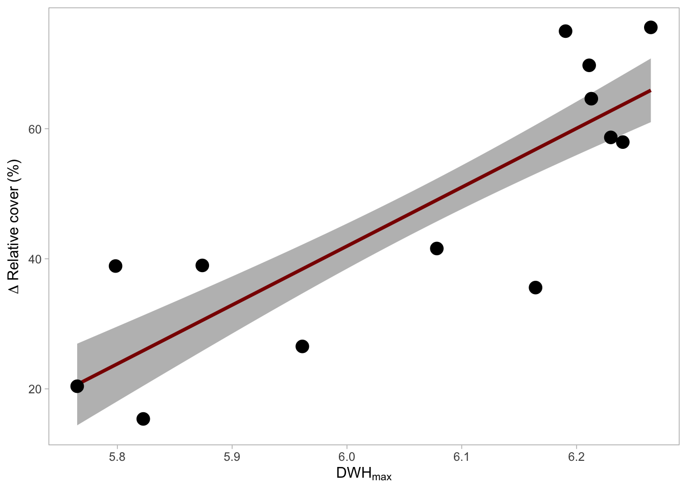
Meaning
The intensity of the heat stress, measured as the maximum degree heating weeks in 2019 (DHWmax), significantly impacted the decline in coral cover (t(11) = 5.036, p < .001, adj. R2 = 0.67). The expected relative decline in coral cover increased by 90.5% ± 18.0% (SE) per unit of DHWmax.
Task 2.6: Regression visualisation
Plot the coral cover data and model in a similar way
# Make a new data frame with sequence of x values
1ndat_coralcover_dhw <-  data.frame(______ = seq(min(______),
2                                                 max(______,
3                                                 length = ______))

# Predict data
4pred_coralcover_dhw  <- predict(______,
5                                newdata = ______,
6                                se.fit = T) %>%
7                        bind_cols(______)

# Plot
8ggplot(mapping = aes(x = ______))+
  # Plot SE
9  geom_ribbon(data = ______,
              aes(ymin = ______,
                  ymax = ______),
              fill = "grey")+
  #Plot model
10  geom_line(data = ______,
            aes(y = ______),
            col = "darkred", linewidth = 1.2)+
  # Plot raw data
11  geom_point(data = ______,
aes(y = ______), size = 4)- 1
-
Make a new data frame and call it
ndat_coralcover_dhw. Add a column calledmax_dhwcontaining a sequence from the minimummax_dhwvalue indat_change_coral_cover - 2
-
to the maximum
max_dhwvalue. - 3
- The sequence should have 100 entries
- 4
-
Based on the model
m_change_coral_cover, predict values and store them in a new data frame calledpred_coralcover_dhw. - 5
-
The predicted values should be done for
xvalues inndat_coralcover_dhw. - 6
- Also predict the standard error.
- 7
-
predict()only returns the predicted values. For plotting, add again thexvalues stored inndat_coralcover_dhw. Now you are set up for the plot. - 8
-
Store in
aes()the axes that will be used in all layers.max_dhwshould be plotted on the x axes. - 9
-
Add a
geom_ribbon()for the predicted data ± the standard error (fit - se.fitforyminandfit + se.fitforymax). These columns are inpred_coralcover_dhw. - 10
-
Now, add the regression line with
geom_line(). The columnfitinpred_coralcover_dhwshould be used as y axis. - 11
-
Then, add the raw data that is stored in
dat_change_coral_cover. Userel_changeas y axis.
# Make a new data frame with sequence of x values
1ndat_coralcover_dhw <-  data.frame(max_dhw = seq(min(dat_change_coral_cover$max_dhw),
2                                                 max(dat_change_coral_cover$max_dhw),
3                                                 length = 100))

# Predict data
4pred_coralcover_dhw  <- predict(m_change_coral_cover,
5                                newdata = ndat_coralcover_dhw,
6                                se.fit = T) %>%
7                        bind_cols(ndat_coralcover_dhw)

# Plot
8ggplot(mapping = aes(x = max_dhw))+
  # Plot SE
9  geom_ribbon(data = pred_coralcover_dhw,
              aes(ymin = fit - se.fit,
                  ymax = fit + se.fit),
              fill = "grey")+
  #Plot model
10  geom_line(data = pred_coralcover_dhw,
            aes(y = fit),
            col = "darkred", linewidth = 1.2)+
  # Plot raw data
11  geom_point(data = dat_change_coral_cover,
             aes(y = rel_change), size = 4) +
  # Formatting
  labs(x = expression(DWH[max]),
       y = expression(Delta~Relative~cover~"(%)"))+
  theme_light()+
  theme(panel.grid.major = element_blank(),
panel.grid.minor = element_blank())- 1
-
Make a new data frame and call it
ndat_coralcover_dhw. Add a column calledmax_dhwcontaining a sequence from the minimummax_dhwvalue indat_change_coral_cover - 2
-
to the maximum
max_dhwvalue. - 3
- The sequence should have 100 entries
- 4
-
Based on the model
m_change_coral_cover, predict values and store them in a new data frame calledpred_coralcover_dhw. - 5
-
The predicted values should be done for
xvalues inndat_coralcover_dhw. - 6
- Also predict the standard error.
- 7
-
predict()only returns the predicted values. For plotting, add again thexvalues stored inndat_coralcover_dhw. Now you are set up for the plot. - 8
-
Store in
aes()the axes that will be used in all layers.max_dhwshould be plotted on the x axes. - 9
-
Add a
geom_ribbon()for the predicted data ± the standard error (fit - se.fitforyminandfit + se.fitforymax). These columns are inpred_coralcover_dhw. - 10
-
Now, add the regression line with
geom_line(). The columnfitinpred_coralcover_dhwshould be used as y axis. - 11
-
Then, add the raw data that is stored in
dat_change_coral_cover. Userel_changeas y axis. ```